Brand kit
Logo, colors, and guidelines
For partners, press, and consultants who link to us. Use these files as they are.
Logo and mark
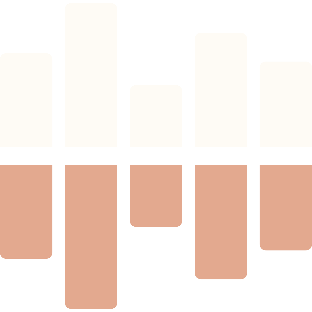
The mark is five bars above a line, each mirrored by a bar of the same height below it. Two views of the same thing, which is what the reports are about. Leave clear space around it at least half its width.
Mark

Wordmark


Full logo


Square logo
For a social post or a printed piece, where there is room for the name. For a small square, like an avatar, use the mark on its own.






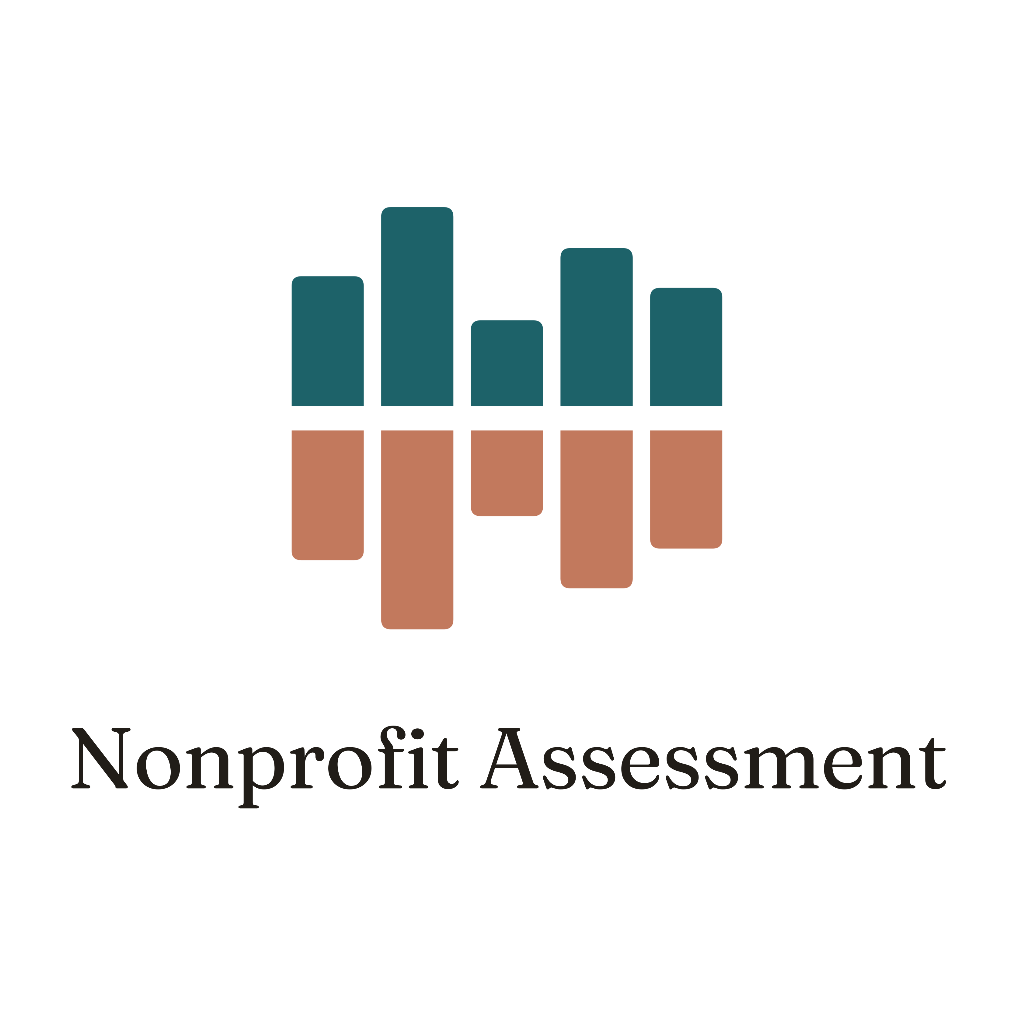

Please don’t recolor the mark, stretch it, or rearrange the bars. On teal, photos, or anything dark, use the version for dark backgrounds. The name is two words, Nonprofit Assessment, with no abbreviation.
The Report, our mascot
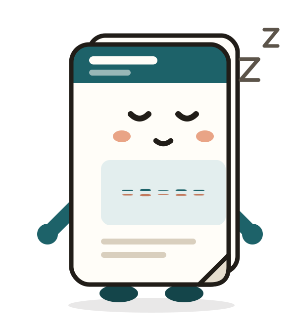
What this tool hands back is a report, so the mascot is one. The chart on its chest is the mark, and it moves like a sound meter while people answer. It listens first, then reports back.
Moods










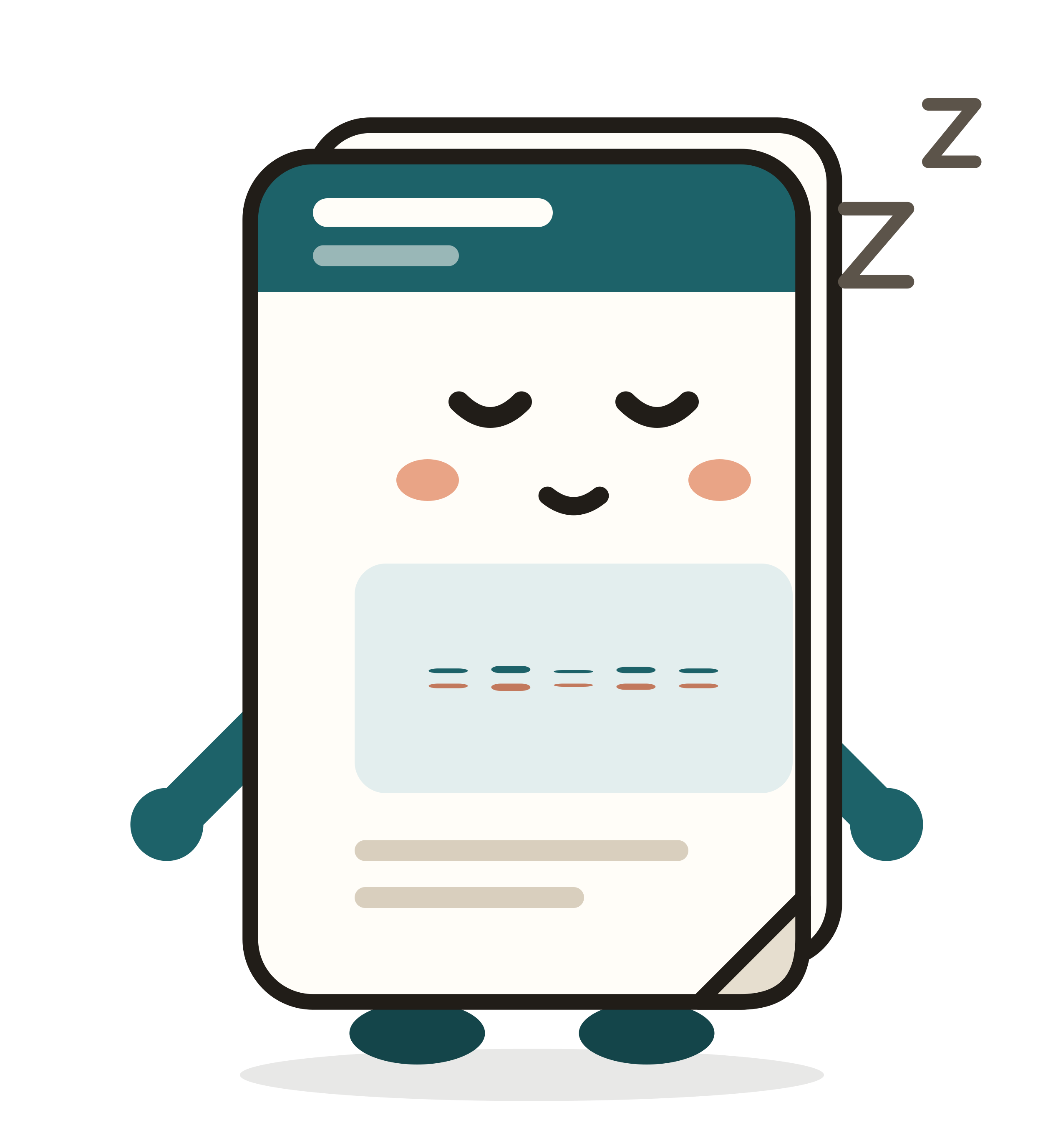
Gestures












Rules
- Teal above the line is the board. Terracotta below is the community. Never swap or recolor them.
- No red, yellow, or green on the character. No color means good or bad.
- No numbers on the character. A score only appears on the page, with its comparison.
- Calm motion. No shakes or spins. Concerned is as low as it goes.
- One sparkle per scene, and only when a report is ready.
- Keep the outline in proportion: 3px at 200px wide.
The SVG files move in a browser and sit still in a design tool. The PNGs are still.
Colors
A warm cream ground, near-black ink, and one deep teal accent. Click a color to copy its hex value.
No color means good or bad. Reports carry a number with its context, never a red, yellow, or green light.
Type
Fraunces for headings and the name. DM Sans for everything else.
Fraunces
Headings and the wordmark. Regular weight.
DM Sans
Body text, buttons, and labels. Regular and medium.
<link href="https://fonts.googleapis.com/css2?family=Fraunces:opsz,wght@9..144,400;9..144,600&family=DM+Sans:wght@400;500&display=swap" rel="stylesheet">
How we write
We help nonprofit boards and staff hear from the people around them and see how they compare with organizations like theirs. We write for board chairs and executive directors with little time and no patience for jargon. The test for any sentence: would you say it out loud to a board chair over a drink.
We are
- Plain, not clever
- Calm, not urgent
- Free, with nothing held back
- Careful with what people tell us
In copy
- Short, declarative sentences
- No exclamation points or growth-copy patterns
- A score always comes with the comparison behind it
- “Board,” “organization,” “report,” never users, accounts, or dashboards
Questions about using the logo, or need something not here? hello@upspire.studio